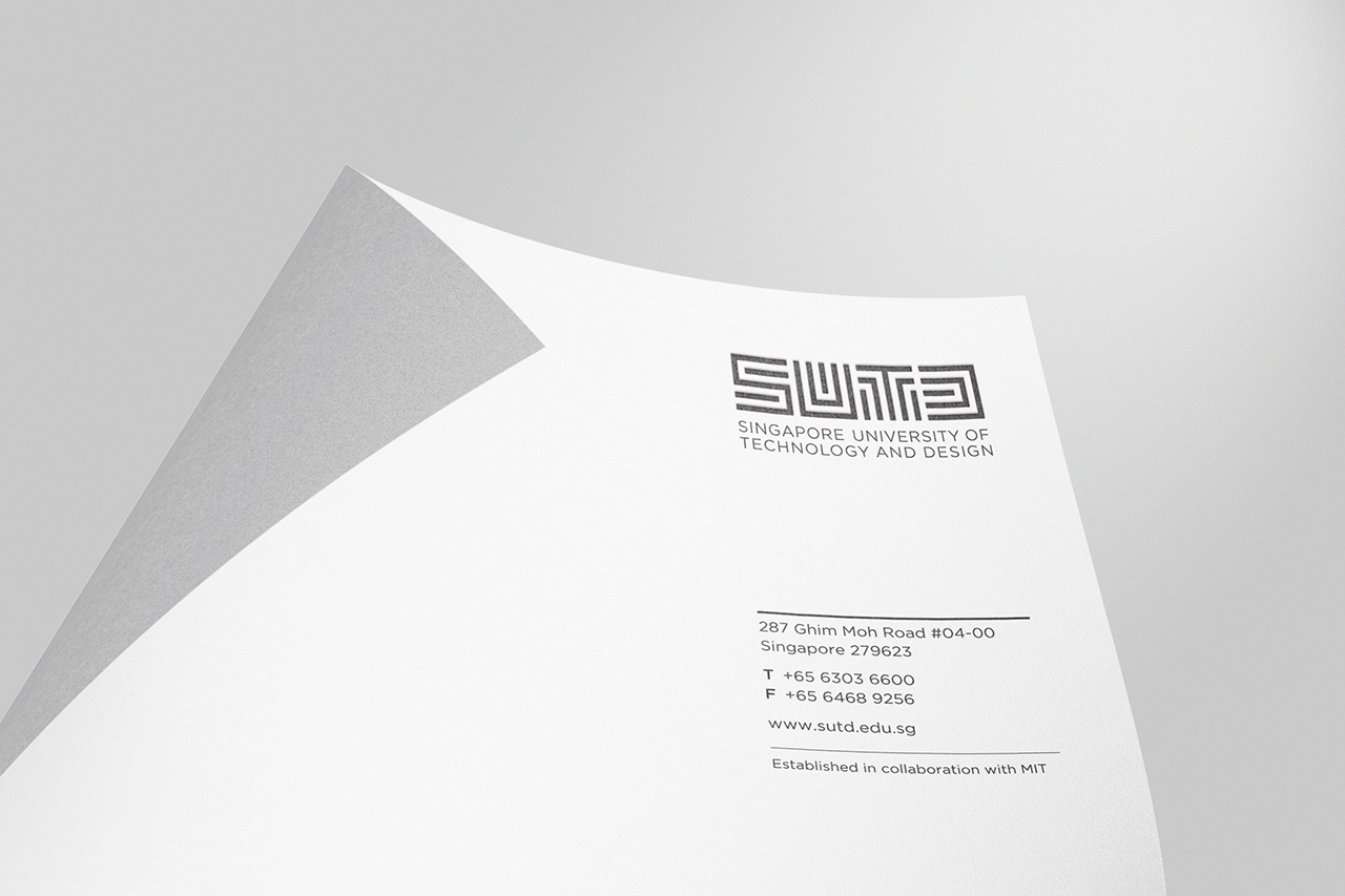
The Singapore University of Technology and Design is Singapore’s fourth university, established in collaboration with the prestigious MIT from USA and Zhejiang University from China.
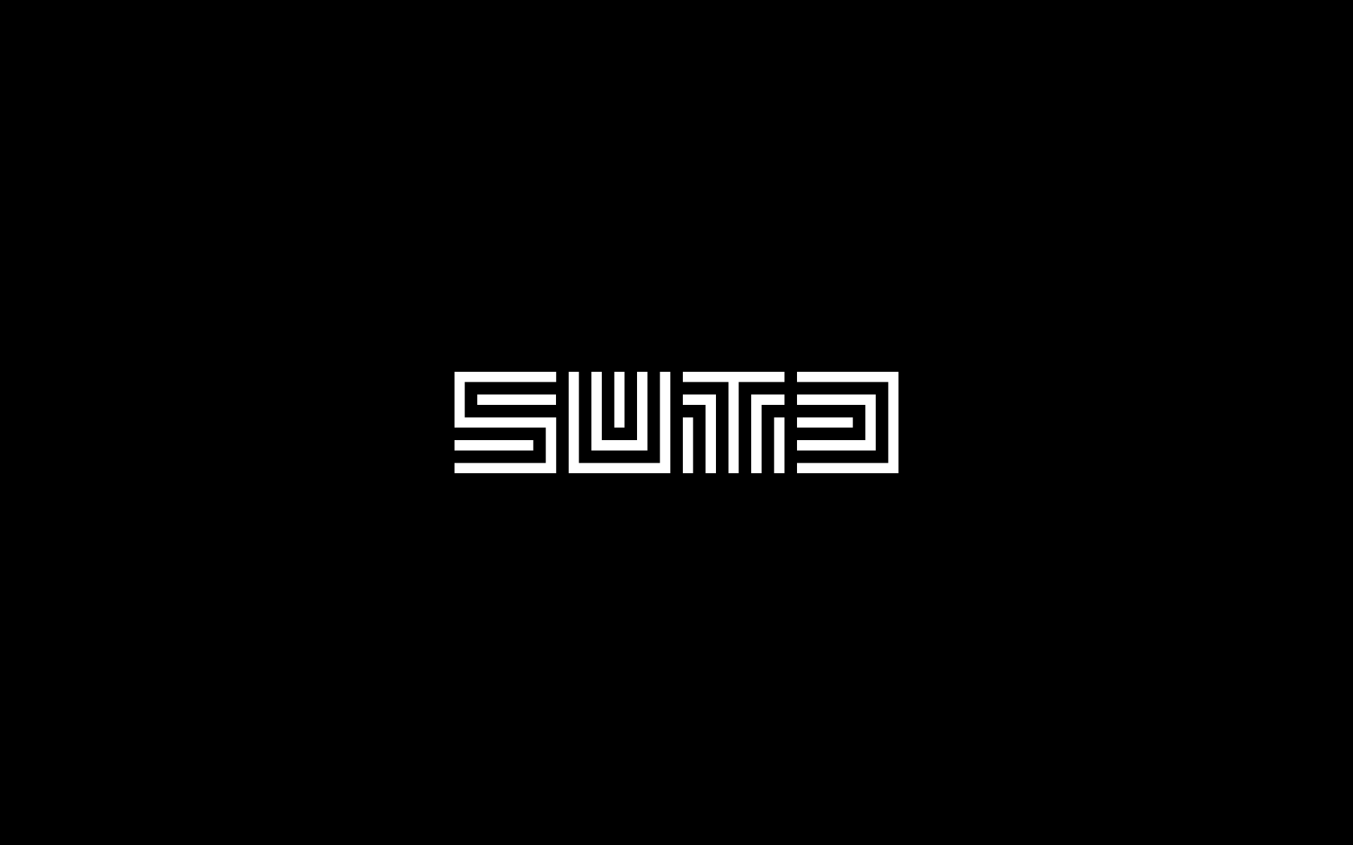
When it comes to the creation of the logo for the university, the challenge is to craft a symbol that does not conform to the typical badge. As a design-focused university, the identity has to be modern and fresh, simple yet meaningful. In capturing the characteristics of the university, the logo has to also communicate the importance of theoretical knowledge and the wisdom of practical application; the art of design and the science of technology; and the tradition of the East and modernity of the West.
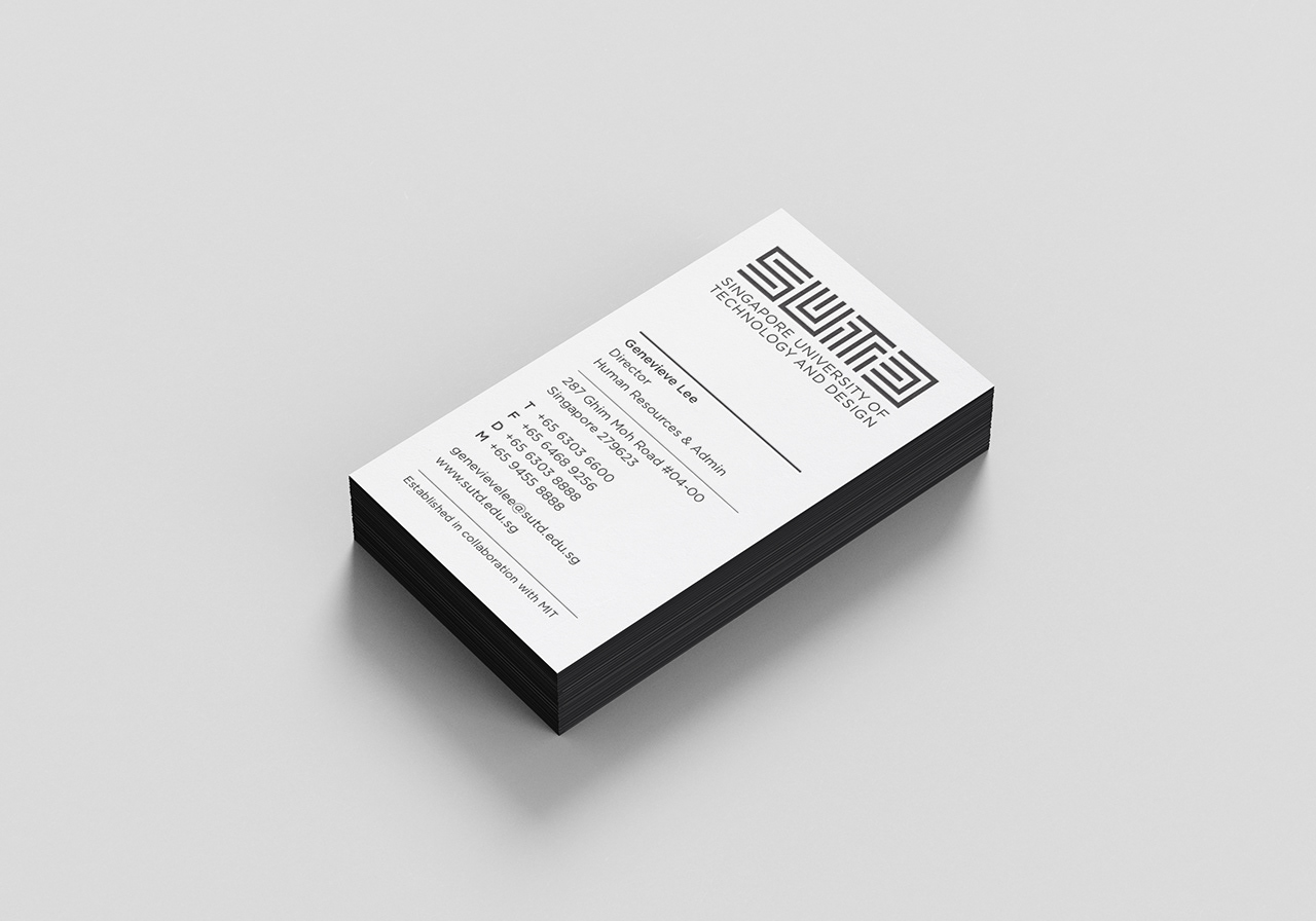
The logo is spelt SUTD, read either from left to right in a Western context, or top to bottom in a Chinese style. It is composed entirely of four letters patently spelling out the acronym of the university. The black lines making up the letters are of a singular thickness, imbuing the identity with an abstract sense of scientific rigour. There is no other graphic element; none is needed.
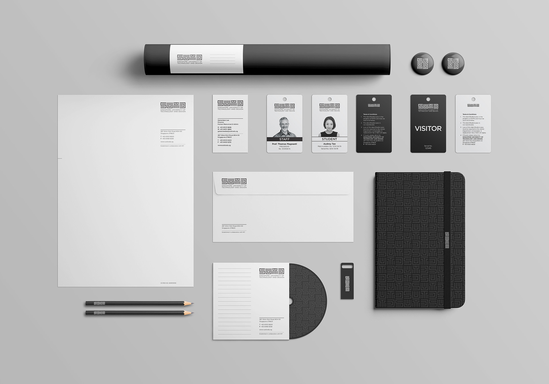
Visually, the individual letters allude to a Chinese seal (the stamp of approval), a microchip (the science of technology), a problem-solving maze (the art of science) and a hexagram from the I-ching (the wisdom of the ages). Three versions of the logo—horizontal, vertical or square—allow for flexibility in application while retaining design integrity.
The logo won the Gold Award in the graphic design category of the 2010 Singapore Design Award. The competition was organised by the Designers Association of Singapore and judged by an international panel from USA, Europe, the Middle East and Asia, honouring outstanding design from around the world.